

Original Post


More than you know
Hey gz, i need in ur opinions bout my drawings. I wanna associate my profession with design and drawing, so i need critics from guys who really know howtodo in art: artists, graphic designers etc. Love ya all <3
1/ Sing with me

2/ Rippeep
3/ Saddy

4/ Kkkkkk
5/ Matrang
6/ Miyagi
7/ Lookatme

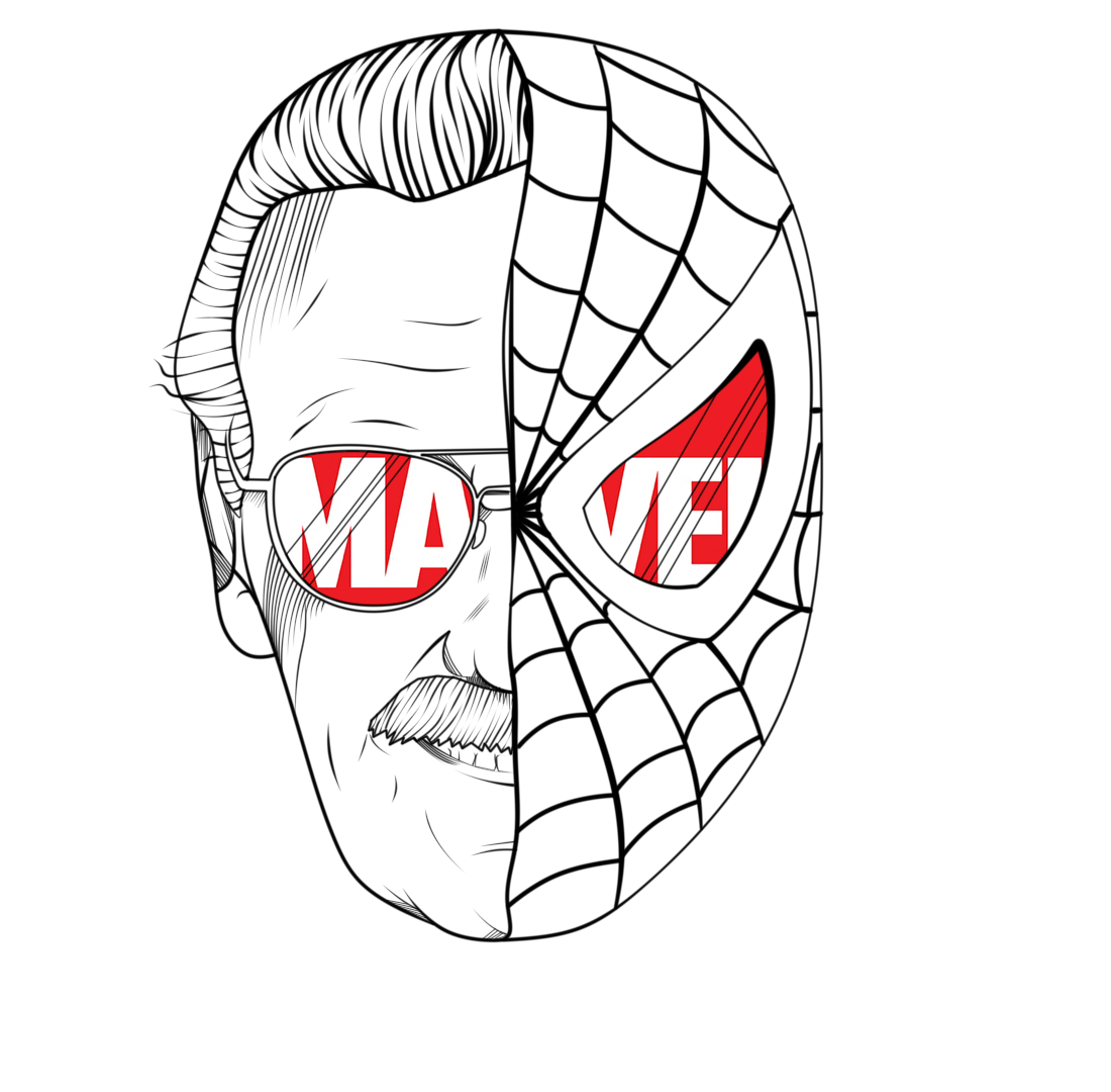
8/ Stan Lee
Last edited by D3571NY; Nov 14, 2018 at 09:02 AM.
Every image is broken
[sigpic]https://cache.toribash.com/forum/sig...5309978_20.gif[/sigpic]
awesome stuff! one peace of advice i'd give you is to draw more sharp at some places, for example the first pic - the wings feather's ends. It's those small parts that throw me of haha, you just can't miss it. And the chick with the darker body skin tone looks really weird for me aswell. Other than that it's cool. Hope to see some more of your stuff.
[SIGPIC]https://i.imgur.com/JJvmOHS.gif[/SIGPIC]
Thank you, Crollex :3. Ye, sure, ends of wings - they are really rounded, i'll fix em. Aboout girl i'm sure too, i did it at low screen brightness and didnt see it. Yes, i'll complement the thread and notify you about it. Thank you again!
Clint, idk about ur problem. Guys, if u have same bug, please, post here and i'll download them at another host.
Clint, idk about ur problem. Guys, if u have same bug, please, post here and i'll download them at another host.
Last edited by D3571NY; Nov 8, 2018 at 11:06 PM.

not too sure what clint is on about. entirely possible that his computer wasn’t receiving information fast enough so he couldnt open the spoilers.
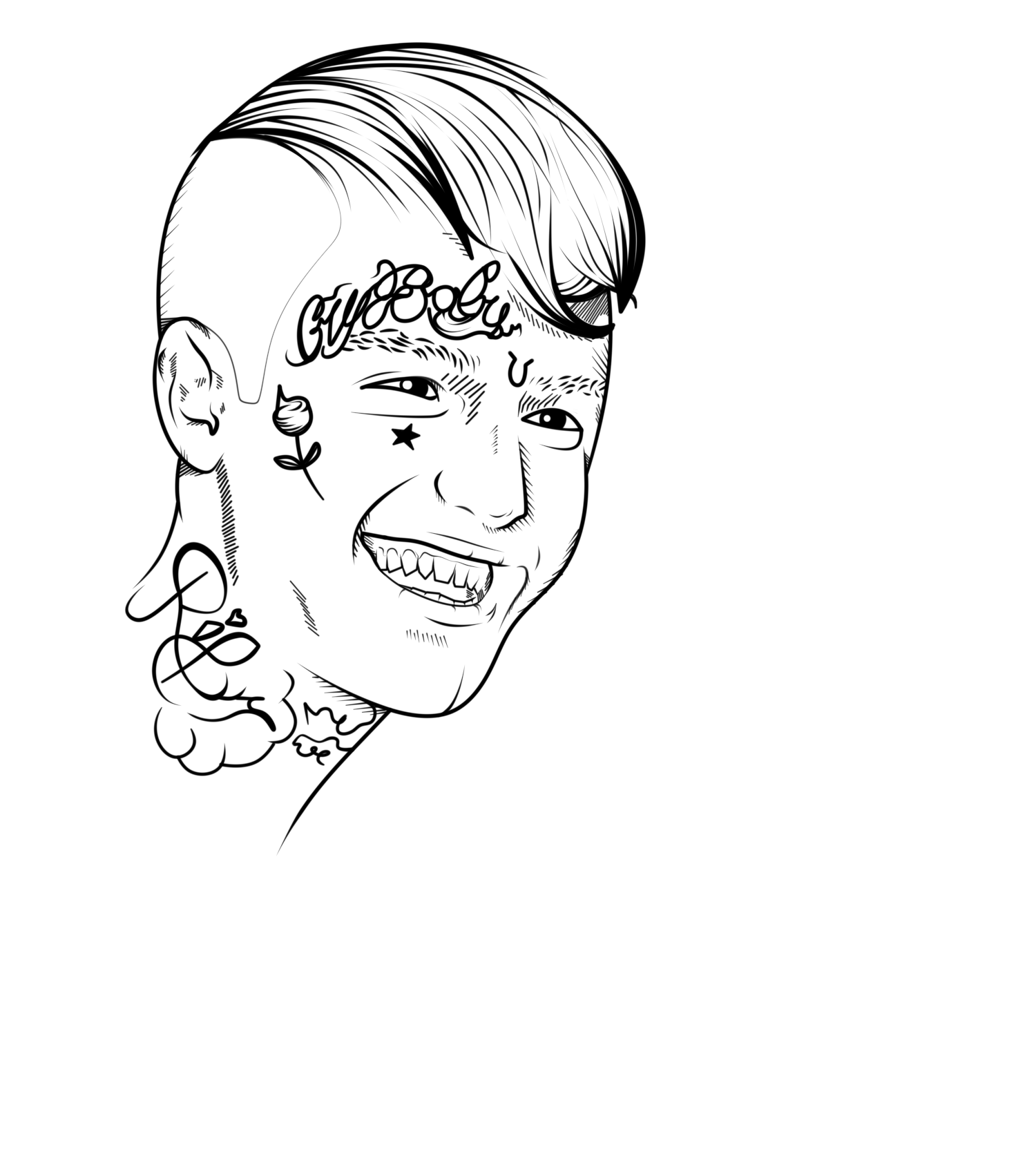
!may be big
the wings are throwin me off as well
id look at the anatomy of wings, because right now you have 1 column of wing parts whereas an actual wing has 2 columns. i think theres a drawing tut online for that kind of thing.
besides nitpicky anatomy stuff, the orientation is whats mainly throwing me off. the way the wings are drawn makes him look like hes standing at an angle looking off towards the viewer’s left.
the jacket implies his body is facing directly at the viewer, and causes a disconnect that, while not bringing everyone to this conclusion, makes the viewer feel like something is “off.”
change that midline of the jacket or add some folds in the jacket
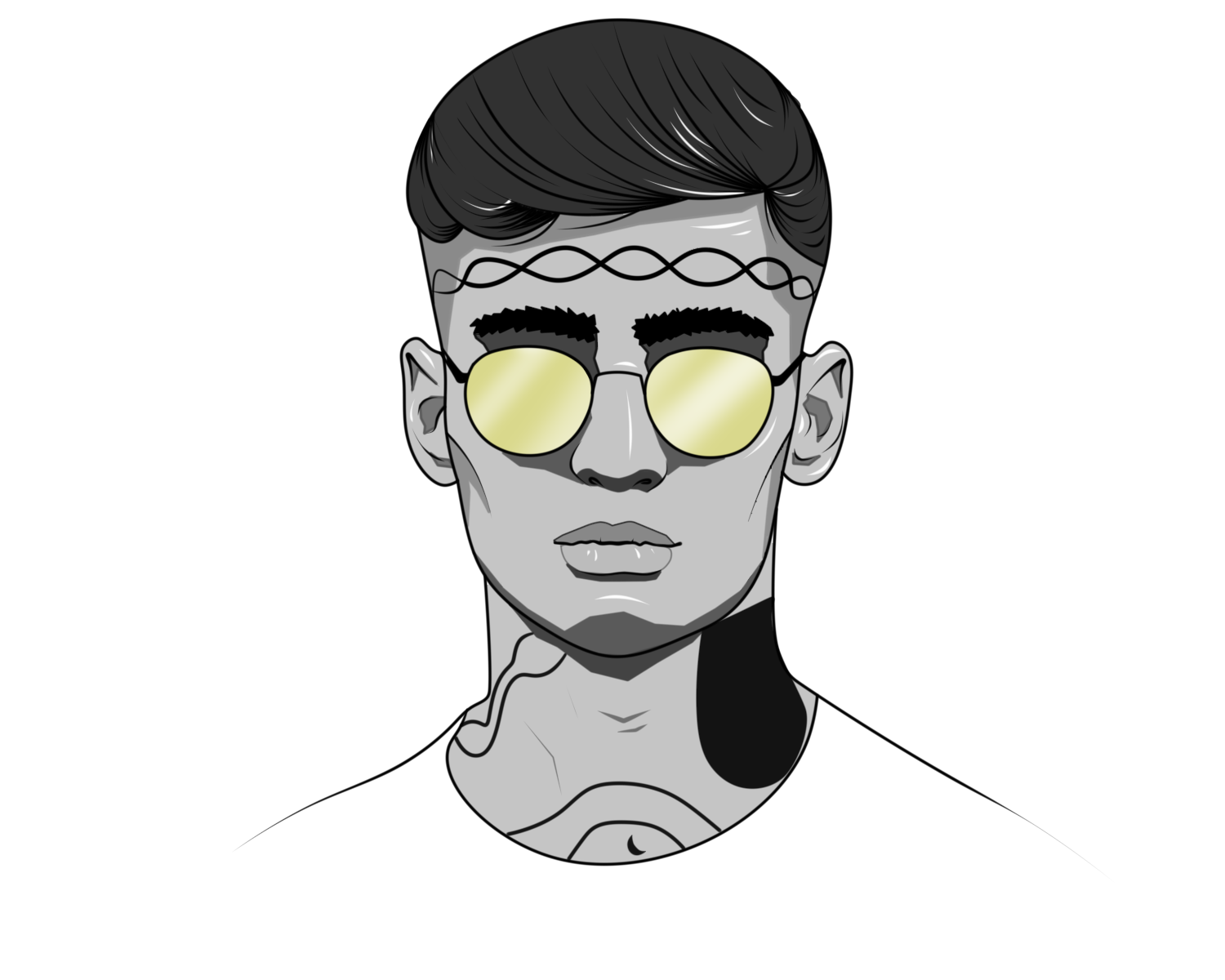
!too
something thats important in vector art is staying consistent. im not sure if you’re done with this one, but im gonna assume you are.
line thickness variation is good in the hair. this variation is seemingly nonexistant everywhere else in the piece. id experiment more with this variation. a good rule of thumb is to have parts closer to the viewer have thicker outlines.
try completely silhouetting your art. if you can no longer distinguish what you’re looking at, you should try to make some different design choices.
a good way to avoid this is removing tangents. example in this piece: the ear. the lines touching it are almost diminishing the ear’s presence and makes it seem flat.
nitpicky, but continue shading with hatching like you did underneath the hair on his forehead
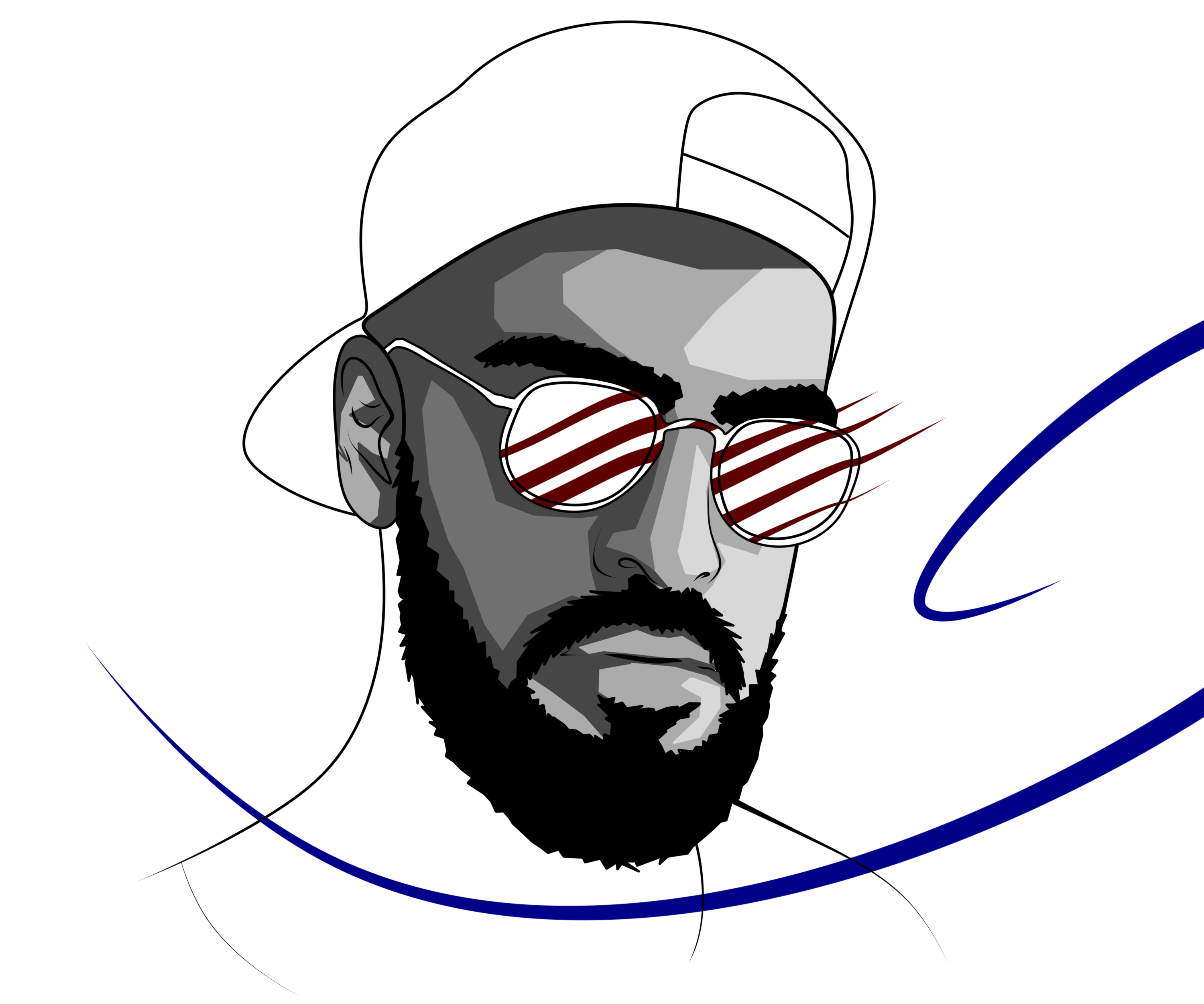
!its too
this piece shows youre completely capable of doing pretty much everything ive mentioned this far. the hair’s line thickness works here since its physically in front of his face. nothing to say here
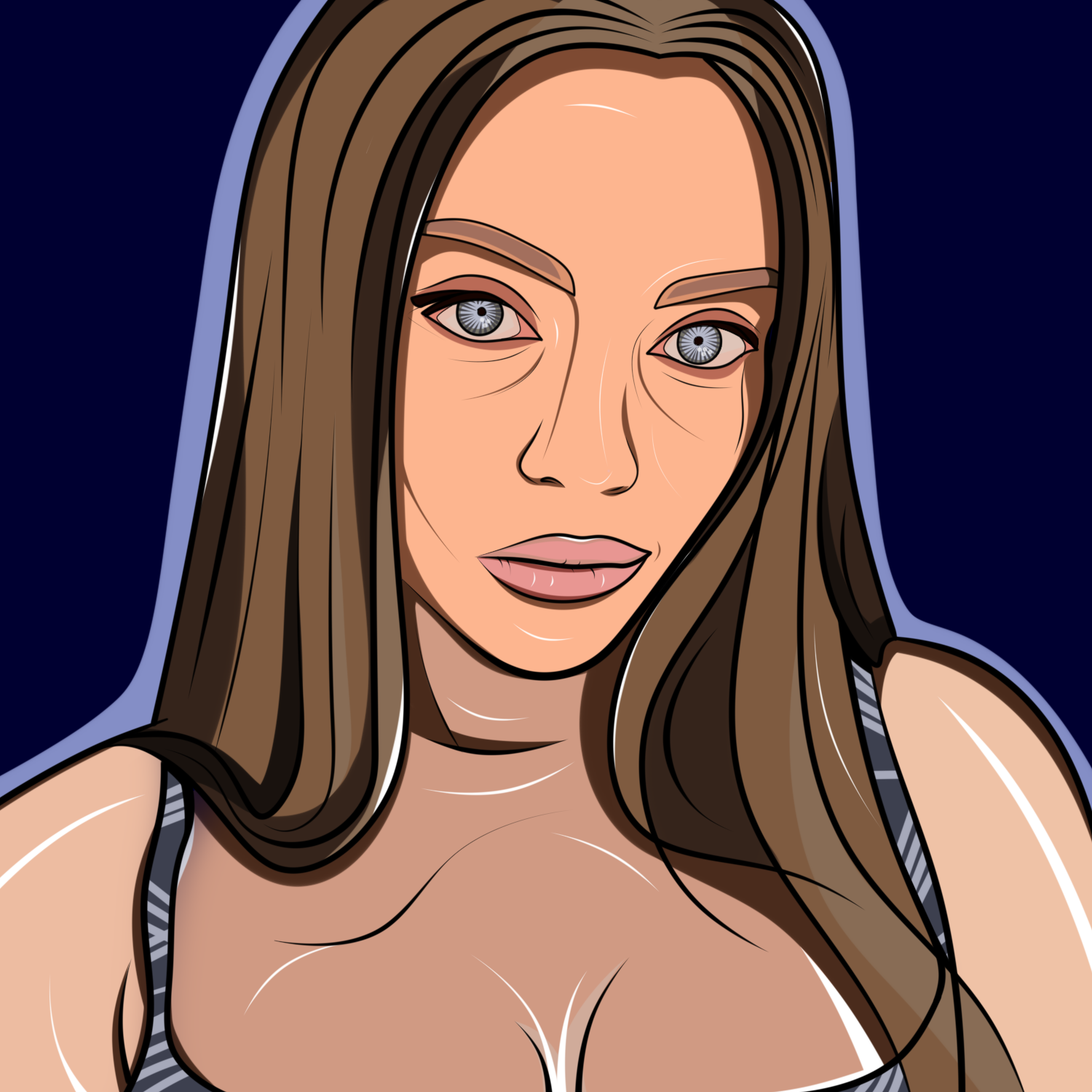
!warning
i’ll be honest, but it seems you just colorpicked from the picture in this one. also not sure what that gradient is doing there on her right strap, (our left her right). mightve been accidental on your part perhaps?
id stick to using the same color as the face for all of the skin parts, and then relying on shadows like you did on the face to add depth. idk what the context is since i dont know what the reference looks like, but regardless the darker coloration in the chest/neck doesnt read as a shaded area.
!alarm
try smoothing the vectors of the shadows. either that or contour them to better resemble the edge theyre close to.
other than that i dont see anything wrong with this
!may be big
the wings are throwin me off as well
id look at the anatomy of wings, because right now you have 1 column of wing parts whereas an actual wing has 2 columns. i think theres a drawing tut online for that kind of thing.
besides nitpicky anatomy stuff, the orientation is whats mainly throwing me off. the way the wings are drawn makes him look like hes standing at an angle looking off towards the viewer’s left.
the jacket implies his body is facing directly at the viewer, and causes a disconnect that, while not bringing everyone to this conclusion, makes the viewer feel like something is “off.”
change that midline of the jacket or add some folds in the jacket
!too
something thats important in vector art is staying consistent. im not sure if you’re done with this one, but im gonna assume you are.
line thickness variation is good in the hair. this variation is seemingly nonexistant everywhere else in the piece. id experiment more with this variation. a good rule of thumb is to have parts closer to the viewer have thicker outlines.
try completely silhouetting your art. if you can no longer distinguish what you’re looking at, you should try to make some different design choices.
a good way to avoid this is removing tangents. example in this piece: the ear. the lines touching it are almost diminishing the ear’s presence and makes it seem flat.
nitpicky, but continue shading with hatching like you did underneath the hair on his forehead
!its too
this piece shows youre completely capable of doing pretty much everything ive mentioned this far. the hair’s line thickness works here since its physically in front of his face. nothing to say here
!warning
i’ll be honest, but it seems you just colorpicked from the picture in this one. also not sure what that gradient is doing there on her right strap, (our left her right). mightve been accidental on your part perhaps?
id stick to using the same color as the face for all of the skin parts, and then relying on shadows like you did on the face to add depth. idk what the context is since i dont know what the reference looks like, but regardless the darker coloration in the chest/neck doesnt read as a shaded area.
!alarm
try smoothing the vectors of the shadows. either that or contour them to better resemble the edge theyre close to.
other than that i dont see anything wrong with this