

Original Post


[Art] Self Portrait
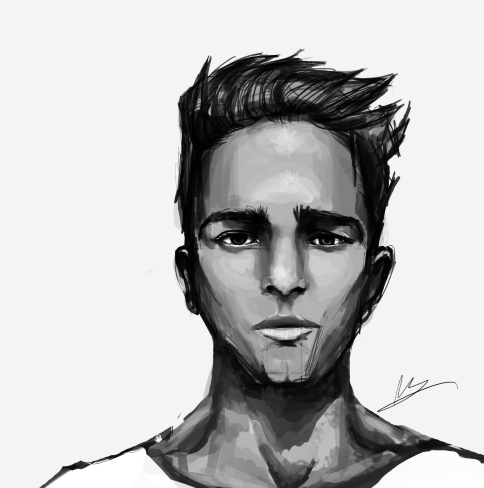
So I drew me. I used a Wacom Intuous 4 and Photoshop CS6.
I still have no idea how to use colour; just picture a brown guy.
It's a bit caricaturesque but when I try to add realism the whole image loses power. At least I think so. Like the strokes become a bit less confident and more blurry and lame really. Anyone else had this problem? How did you overcome it?
Also just any general tips would be great
My heart just wouldn't be in it, you know? haven't got one.
I like the clay feeling, but hate the eyes and lower lip - they feel both so out of place.
Jalis: Freelancer, you're a duck | Sachi: Freelancer, you're a duck | Reanimator: Freelancer, you're a duck
satiknee: Freelancer, you're a duck | Wiggi: Freelancer, you're a duck | Tarlan: Freelancer, you're a duck
satiknee: Freelancer, you're a duck | Wiggi: Freelancer, you're a duck | Tarlan: Freelancer, you're a duck
I really like how it turned out, but I believe the nose could use a bit more work, I don't know, it's kind of smooth compared to the other parts. Also, I think the ears are a bit too low, but I don't really know how you look so I'll just say that it's pretty okay
use the smudge tool and soft brush and mix the shading to smooth it out.
it should add a kind of realistic touch to this.
i like the kind of outline you did.
well done.
I remember you posting in the gata thread when you first got your tablet.
you've come a long way c;
it should add a kind of realistic touch to this.
i like the kind of outline you did.
well done.
I remember you posting in the gata thread when you first got your tablet.
you've come a long way c;
damn im gettin old
Wish you would've posted the reference pic or something so we could see how the
proportions were done, as we don't know what you look like, but just from this, the
proportions do look good. I want to say the ears look a little low and small, but maybe
that's what you look like.
Good job on the eyes and brows and love that cleft chin. ; )
proportions were done, as we don't know what you look like, but just from this, the
proportions do look good. I want to say the ears look a little low and small, but maybe
that's what you look like.
Good job on the eyes and brows and love that cleft chin. ; )
The past makes you wanna die out of regret, and future makes you depressed out of anxiety. So by elimination, the present is likely the happiest time.