

Original Post


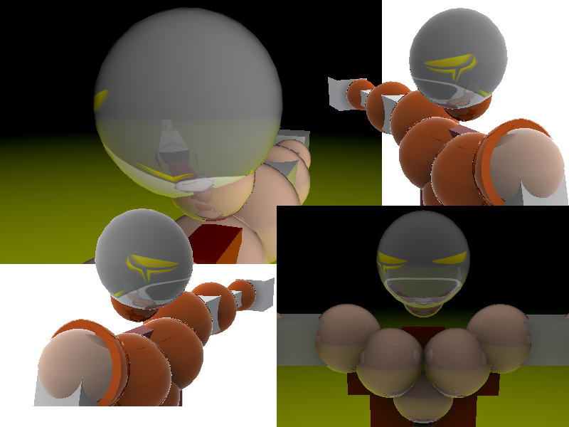
[TEX] Huh ? Simplicity ?
Yeah simplicity is cool and I'm totally making a set for this head
CnC
CnC
Last edited by Tengo; Apr 21, 2011 at 01:49 PM.
<Marco> and then Oblivion tried to sexually assault me
<Oblivion> and Marco wasn't surprised at all
<Oblivion> and Marco wasn't surprised at all
Ha ha
I bet that 50% of all people that post here will say "needs more details".
Lighter part could be removed or replaced with something that makes sense imo.
From sides it looks like a badly done mask but on front it looks like a mouth :v.
This will make into something cool probably. Just wondering how will you get other parts matching this head.
Glow around eyes look abit messy imo and it easily takes unnecessary attention since this is quite simple.
So some fixing there wouldnt hurt.
It's All About Expansion
I got the perfect job for your simplicity style!
Pay might be a little low though?
http://forum.toribash.com/showthread.php?t=263917
Pay might be a little low though?
http://forum.toribash.com/showthread.php?t=263917
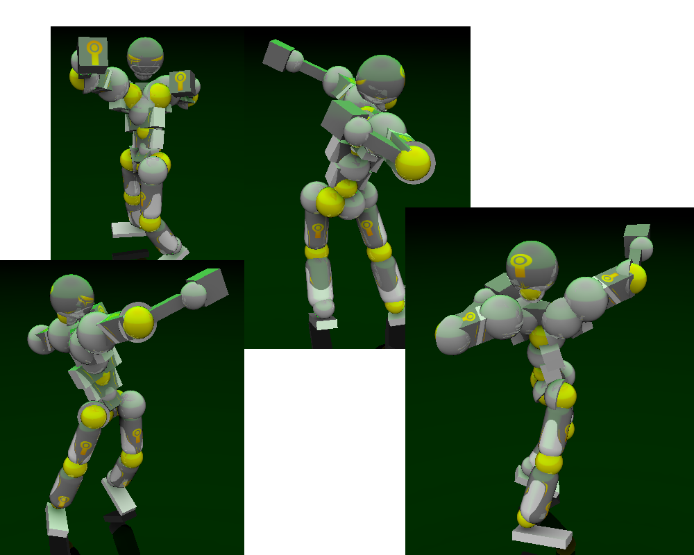
I like the simplicity, but I feel there is a fine line between simplicity and emptiness. This head just feels empty to me. It wouldn't hurt to add a bit more shading around the eyes, and maybe something at the back of the head. But without all that it still looks alright. I'd personally give it a 7/10 at the moment. Can't wait to see the complete set.
-----
I really like it to be honest, although It is slightly emptier than just simple. Maybe a bit of shading around the eyes and something on the back of the head? But that's just my opinion. I can't wait to see the end result with the set. A 7/10 from me until it's complete.
-----
I really like it to be honest, although It is slightly emptier than just simple. Maybe a bit of shading around the eyes and something on the back of the head? But that's just my opinion. I can't wait to see the end result with the set. A 7/10 from me until it's complete.
Last edited by Oimanoi; Apr 20, 2011 at 01:58 AM.
Reason: <24 hour edit/bump
Life is like Basketball. Aim, Concentrate, Balance and Following through. That's all you ever need to accomplish your goals.

In my opinion, it's about.. 1 smudge less than simple.
I like it though.
I like the vauge outline of the eye, and the colored indent in the back/side.
But again, it really is a little bit.. empty.
Maybe you should add a symbol or something in the back of the head?
7/10
I like it though.
I like the vauge outline of the eye, and the colored indent in the back/side.
But again, it really is a little bit.. empty.
Maybe you should add a symbol or something in the back of the head?
7/10
BAD LUCK
