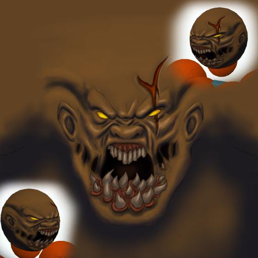
more cuts, also work on those for moar realizm. a real-er skin texture. blood. eye glow. bigger eyes? gums are wet, wet has pin point lights. bring elements of the body into the face if you need more details and shading. since you aren't doing the set.
idk just things i would poke if i was doing it.
perhaps your reference?
idk just things i would poke if i was doing it.
perhaps your reference?
more forehead cuts and stuff and "be better"
gotcha :P
not so sure how to go about a more realistic texture for the skin, struggling enough with using what Ive learnt up to now.
I know how skins supposed to look, and everytime i learn something new it gets closer, but no idea to get the pores right or that natural shine/luminence.
could probably get it with a layerstyle or something to do with the whole levels and curves thing.
should probably start and finish certain aspects befor starting on others so i can test out the possibilities with that properly.
was thinking of adding protrusions/bumps to the back of the head like his spine on the model, but feels like im just grasping for ideas.
will mess around with a few more exposed scars, see what i can do about the blood, another thing im clueless on, that wet finish
also, that reference was one of them, mostly just referred back to his default portrait icon though
-=Art is never finished, only abandoned=-
Something about colors, eh?
I really just stick to the basics for the most part. Things like using really cool colors such as de-saturated blues, purples, greens in dark places; under the brow, in wrinkles, under the nose and such. The colors you have in wrinkles and under the brow at the moment seem very hot to me. Just doesn't seem natural.
I personally feel that going pretty dark in most of the aforementioned places helps define shapes and make things pop more, but I remember you always said I went a little too far with that stuff ; )
The other end of the color wheel works nice for highlights and you can go much more saturated than what you've got so far. For the natural shine you were talking about.
Pretty sure everyone already knows this stuff but you know...
Not really sure how I'd go about making a realistic skin texture that would look good with that gentle/clean looking style you have going on. You could always take a hint from that reference chillz posted and just paste some sort of canvas texture all over the face ; )
Also ya, I usually don't "cnc" or anything since it makes me feel kind of douchey. But whatever, chillz made me do it!
Last edited by Jebus; May 7, 2014 at 12:08 AM.
Originally Posted by Jebus

Something about colors, eh?
I really just stick to the basics for the most part. Things like using really cool colors such as de-saturated blues, purples, greens in dark places; under the brow, in wrinkles, under the nose and such. The colors you have in wrinkles and under the brow at the moment seem very hot to me. Just doesn't seem natural.
haha, i just open up the colour picker untill come onto something that just looks pretty, sorta.
will put a bit more thought into colours.
Originally Posted by Jebus
I personally feel that going pretty dark in most of the aforementioned places helps define shapes and make things pop more, but I remember you always said I went a little too far with that stuff ; )
haha, you used to, but its not as severe as it used to be.
you shade very much in the extremes, your shadows are dark dark, and your highlights are white white.
i fully agree that going dark in the cracks helps define the shapes, its part of the reason i outline and attack the dark parts with a small black brush.
Originally Posted by Jebus
The other end of the color wheel works nice for highlights and you can go much more saturated than what you've got so far. For the natural shine you were talking about.
not so sure what you mean with this part, do you mean highlight with lighter colours?
or do you mean that if youre shadowing in cool tones, you should be highlighting in warm tones?
Originally Posted by Jebus
Not really sure how I'd go about making a realistic skin texture that would look good with that gentle/clean looking style you have going on. You could always take a hint from that reference chillz posted and just paste some sort of canvas texture all over the face ; )
was thinking the same thing, Jusmi does it and he reckons its not cheating.
Originally Posted by Jebus
Also ya, I usually don't "cnc" or anything since it makes me feel kind of douchey. But whatever, chillz made me do it!
CnC is for the stronk.
Never really cared if i came across as douchey or not, if my comments help someone, then mission accomplished.
Thanks for your thoughts bro.
will try work on the colour choices, it sounds like alot more thinking than Im used to though, lol
-=Art is never finished, only abandoned=-