Endurance Onslaught 6.0
z0d1ak25,...

wafflez, Going really good except i like it more when it was yellow , Back looks a lot better now but it looks like an early wip so i can't really say more except add something more there.


Razasha, youa re going for vermine/aveance style? if so you are getting hang of it. Though it is blurry and there are mirror seams. Just keep on trying.


Dirtnapp, the first one has really ncie colors, but I really don't see anything special in it.
On the second one you haven't blended the character in to the background really well, But your smudging looks really nice and the colros aren't so bad either.
Want to join GATA?Apply here
Free textures
trying to find my own style:


pls don't care about the shape as i didn't at all
I'm Tasty and I know it.
I like Rocks.
Originally Posted by LWafflez View Post
I would CnC but I don't know what you're trying to show here.

Made a sig:

i love it. flow's working out. depth's pretty good. Lighting's in it's place. The only thing that i find out of place is the emptiness of the background. Adding fiery effects would definitely improve this alot more.

So, I'm trying to branch out and this is my first attempt.
then i felt insecure and made one like this.

|Cube | Sphere | Cylinder | Torus|
Youtube channel for the shits and giggles
Originally Posted by Z0d1ak25 View Post
trying to find my own style:


pls don't care about the shape as i didn't at all

I don't get what you're trying to do there, for better c&c finish at least half of the head.

Originally Posted by LWafflez View Post
I would CnC but I don't know what you're trying to show here.

Made a sig:

I currently love that signature, but I agree with raiden its a bit empty there... that is all that it's missing really. Other then that keep up the good work.

Originally Posted by raiden224 View Post
i love it. flow's working out. depth's pretty good. Lighting's in it's place. The only thing that i find out of place is the emptiness of the background. Adding fiery effects would definitely improve this alot more.

So, I'm trying to branch out and this is my first attempt.

then i felt insecure and made one like this.

I kinda like the crysis signature but I think it's missing a bit more, I get the feeling it have more depth and lighting to your other works, I can't wait to see the finish version.


Trying to fix the parts that i"m missing in signature, I'm still not near the road that I must be on but here is another one.

Last edited by iNoTo; Feb 21, 2011 at 07:11 PM.
| GATA | Guild Wars 2 | Anime United |
Originally Posted by raiden224 View Post
So, I'm trying to branch out and this is my first attempt.

then i felt insecure and made one like this.

1.) The render is blended in nicely with the background. I like think it's pretty nice for the most part. There's that bright section on the right side that is a tiny bit distracting and the background seem a little messy IMO. I'm a fan of the depth on this one.

2.) It's really nice. There's something about it that's bothering me but I can't put my finger on it.

Originally Posted by iNoTo View Post
Trying to fix the parts that i"m missing in signature, I'm still not near the road that I must be on but here is another one.


It looks pretty good, though the focal doesn't stand out enough IMO. The wooden pole and his foot totally kill the flow you were going for. Other than that I like it. Good lighting.


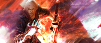
I added a stock of fire behind him and changed the lighting to match:

I think it looks better, thanks raiden
I added a stock of fire behind him and changed the lighting to match:

I think it looks better, thanks raiden [/QUOTE]

That definitely looks sexy now , I don't see any flaw in there for now I guess.


New signature:

Stock:


Last edited by iNoTo; Feb 21, 2011 at 07:52 PM.
| GATA | Guild Wars 2 | Anime United |
I didn't think the stock would work when I saw it.
It turned out alright but it needs some depth. That's the only real problem I see with it.
Maybe play around with the text too.

IMO, the third is the best.
Originally Posted by Dirtnapp View Post
You fucking hate anything I make don't you Alpha.

Just trying to help here.
-----
Originally Posted by iNoTo View Post
I added a stock of fire behind him and changed the lighting to match:

I think it looks better, thanks raiden

That definitely looks sexy now , I don't see any flaw in there for now I guess.


New signature:

Stock:


[/QUOTE]

Way too much effects on the stock tbh. I'd left it like that, changed colors to fit in and added a background to match.
You kind of messed up the beauty of the drawing with the fat lines.
Last edited by AlphasoniK; Feb 22, 2011 at 12:19 AM. Reason: <24 hour edit/bump
Fr3styL . Improving by Improvising
I'm an artist.