Toribash
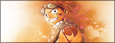
i dont like the joker one, dont take this wrong but u did a poor job making the render blend in, it still needs work.
-----
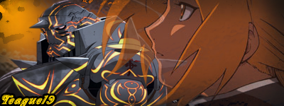
and for the green square lightly erase the edges so it dont look like u just added a green square and changes opacity
Last edited by teague19; Feb 8, 2011 at 11:29 PM. Reason: <24 hour edit/bump
Imma GIMP!
Ok, so since I got Gimp I've been wanting to try out what it can do, here's my "creation" so to speak. I toyed around with effects and brush strokes.

Let me know what you think.
(In attachments)
left is first try, the right is what I changed
Attached Images
Decepticon.jpg (98.4 KB, 10 views)
Decepticon2.jpg (99.3 KB, 10 views)
Last edited by AikidoKP; Feb 9, 2011 at 02:33 AM.
-- Jet -- Somewhere, something incredible is waiting to be known. --
[Secret]AikidoKP

Cogito ergo sum. I think therefor I exist.

I know it's true because it says so right here in this signature.
Originally Posted by aakash77 View Post
aitor !!! can i has the joker one pls :O

no its all mine lol and teague ok so i should blur the sides of the squares? hmmmm i wanted joker to stand out of the image a bit... and aikido its nice i also use gimp... did you make the green thing behind the robot? bg is.... ok
edit: i didint ave the editable file of joker one... T.T *sad* *facepalm*
MY WEBPAGE
[P]Recruiting[P]
Round two!

Tried to enhance the robot Teague, changed filters etc =P
Any suggestions for how to up the detail?

haha Aitor =) Gimp is pretty good so far.
yeah I made the green thing lol, any tips on making it better?
Attached Images
Decepticon3.jpg (99.0 KB, 8 views)
-- Jet -- Somewhere, something incredible is waiting to be known. --
[Secret]AikidoKP

Cogito ergo sum. I think therefor I exist.

I know it's true because it says so right here in this signature.
well i dont really like it much... this moringng i was in a rush... and i could see it well i dont really like it much... separated they look nice but they dont really combine....

hmmm try this.... for bg... creat a layer (any color you want) add anotherone (above it) use aluminum brush... go to filter artistic and cubism... recolor he layer by using colors- color and change it.... then you change the mod of the layer to the way you want....
ehm and for the render you can make a copy of it blur the copy and multiply it or you can also create a copy of it and go to filter-blur-movement to make an efect of some kind...
later add some brush marks and finito...
quick example:
bg:

image:
MY WEBPAGE
[P]Recruiting[P]
Originally Posted by AikidoKP View Post
Round two!

Tried to enhance the robot Teague, changed filters etc =P
Any suggestions for how to up the detail?

haha Aitor =) Gimp is pretty good so far.
yeah I made the green thing lol, any tips on making it better?

that looks good aikido u can also try zooming in by ALOT and outlining some important parts to his machinery

Originally Posted by Aitor21 View Post
well i dont really like it much... this moringng i was in a rush... and i could see it well i dont really like it much... separated they look nice but they dont really combine....

hmmm try this.... for bg... creat a layer (any color you want) add anotherone (above it) use aluminum brush... go to filter artistic and cubism... recolor he layer by using colors- color and change it.... then you change the mod of the layer to the way you want....
ehm and for the render you can make a copy of it blur the copy and multiply it or you can also create a copy of it and go to filter-blur-movement to make an efect of some kind...
later add some brush marks and finito...
quick example:
bg:

image:

yea that is a rush the render was just horrible quality too. nothing in the image fits with the render.
-----
heres some of my work so u dont think im a noob criticizing and not knowing wat im doing myself


heres my second one ever made


heres my first


this isnt one but remember this teague version aikido? haha

-----
more stuffs


Last edited by teague19; Feb 9, 2011 at 05:05 PM. Reason: <24 hour edit/bump
yes i can see it but in the big size image the ends of tori ruin a little bit the hole thing... in the small version you cant appreciate it.
MY WEBPAGE
[P]Recruiting[P]