


Originally Posted by AikidoKP

Bahahaha, Jetfox yes! <3
Sorry Aakash, this one is just too great to beat xD
Are you sure?
"[11:17pm] Thorn: I'm gonna have to ask you to stop being so productive"

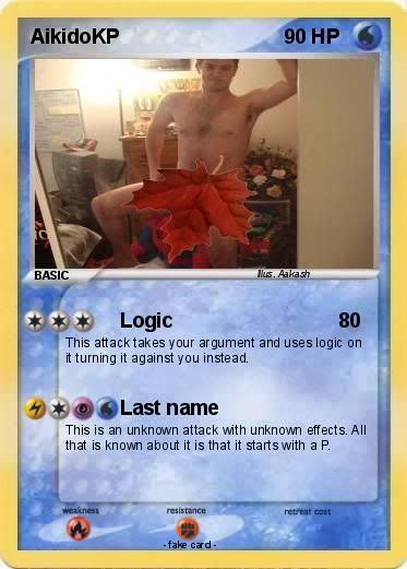
XD teague19 and Aikido had a bet that whoever made 3k QI first meant that the other would have to pose naked with a maple leaf covering their private parts. Aikido lost
"[11:17pm] Thorn: I'm gonna have to ask you to stop being so productive"
